My quinacridone colours and favourite colour combinations
One question that crops up fairly often is why would you purchase quinacridone colours, when other traditional pigments seem so similar? In fact, it cropped up again in my Patreon forum back in December and I've been meaning to write this post since then.
You'll have noticed that I have 3 quinacridone colours on my palette - quinacridone rose, quinacridone sienna and quinacridone gold. At first glance these seem very similar to other more traditional pigments - permanent rose, burnt sienna and raw sienna.
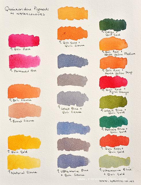
Attached is a swatch sheet that shows the differences between my 3 quin colours and a similar traditional pigment. There are also some of my favourite colour combinations - vibrant greens, transparent reds and oranges - colours that just glow!
Here's a bit of background on quin colours if you're not familiar with them - their history, pigment qualities, advantages and disadvantages.
History
Quinacridone pigments, emerging in the mid-20th century, were initially synthesized for the car industry, offering vibrant and durable colours for car finishes. Their transition into the art world revolutionized the watercolour palette, providing artists with a new spectrum of brilliant and resilient hues.
Pigment Qualities
These pigments are celebrated for their bright, intense colours and exceptional transparency. With a small particle size, they enable smooth, uniform washes. Their high tinting strength is advantageous for creating vivid compositions, and their excellent lightfastness ensures the artwork's longevity.
Advantages Over Other Pigments
Quinacridones are unparalleled in creating deep, transparent darks, allowing for intense shadows and tones without losing luminosity. If you're having trouble getting really strong, dark colours that are not flat and dull, then quin colours really come to the rescue.
Unlike other pigments, quinacridones retain their brilliance in mixes (the paper still shines through and the darks are not flat and dull) and have superior lightfastness, resisting fading under light exposure.
Disadvantages
However, quinacridone pigments are not without drawbacks. Their staining quality can be a challenge, as they bind tightly to paper, making lifting and correcting mistakes difficult.
Additionally, their cost is higher than many traditional pigments, and their intensity may be overwhelming for some artistic styles. It depends on the story you want to tell, but if you're after a soothing, calm scene then quin colours might be overwhelming. But if you want very dark shadows or a pop of colour then they are useful.
Swatches
The first column shows the quinacridone colours versus a similar pigment on my palette.
The second column shows how they make beautiful neutrals when combined with a traditional pigment. Notice, too, how you can combine a quin colour with another colour which has a larger pigment size (like ultramarine) and get beautiful textures.
The third column is some of my favourite colour mixes. All the resulting colours are still transparent and vibrant.
PS
I don't want to cause a buying spree! These colours are expensive and if you're just starting out, then other pigments are completely fine. Especially as quin colours don't replace the others (you'll probably need both). But I hope the information is useful for when you've got a birthday coming up ;-)
I'm off to Italy next week for my last retreat of 2026 and I'm getting all sorts of things ready. One of them is, of course, my palettes. One of the questions I get asked a lot is how I decide which c...
A couple of weeks ago, while hiking with friends in Val Ferret on the Italian side of the Mont Blanc massif, I made a decision that will surprise no one who knows me. An hour in, we stopped to shed ou...
My first watercolour retreat in Spain — Cabo de Gata, September 2027. Four years ago I moved to Spain. I've been painting here ever since — and quietly planning the day I could share it with you. ...